This week we will discover the importance of designing and creating using the elements and principles of design as Taught by the Dutch Master Vermeer

Looking for and Creating VISUAL BALANCE

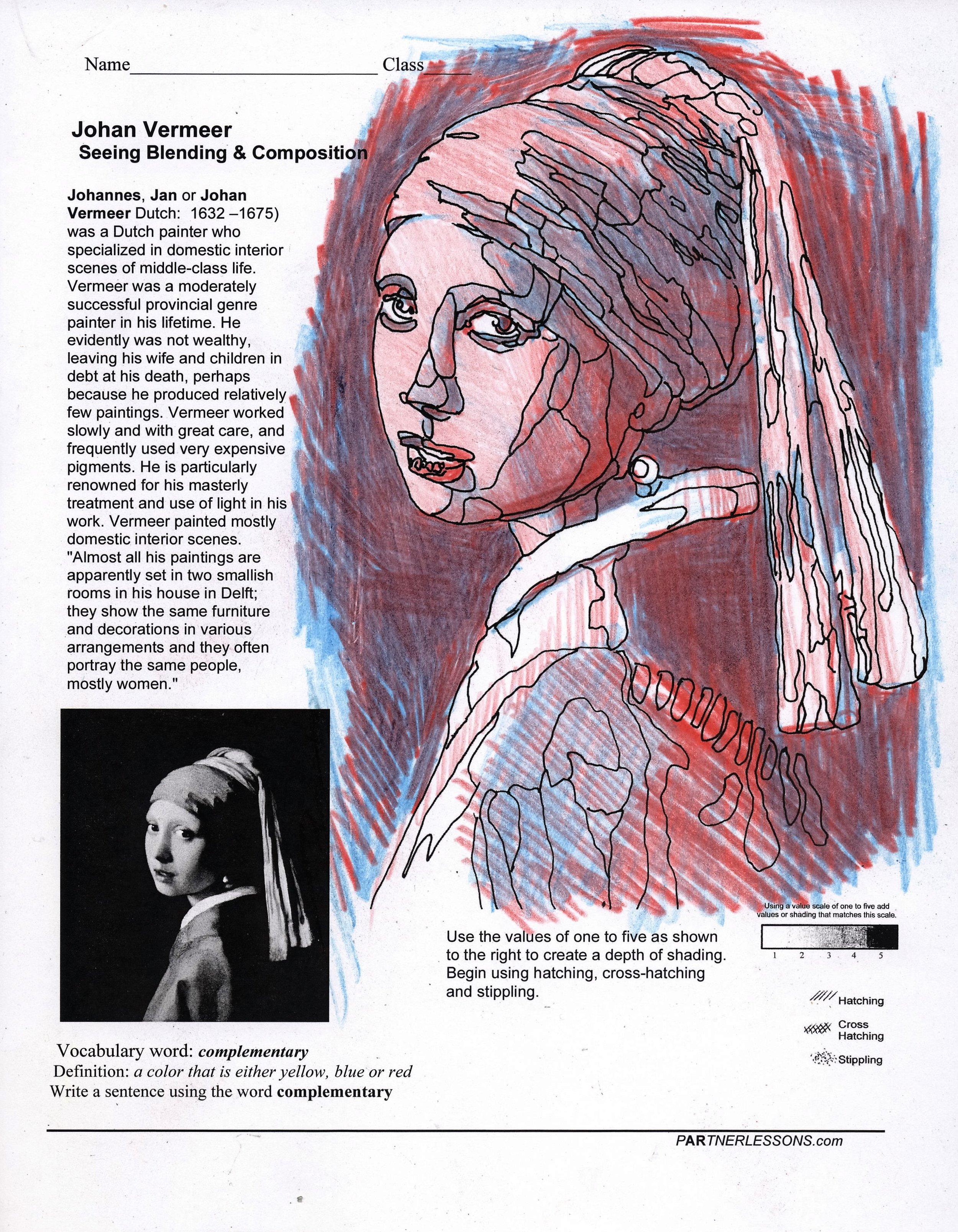
Color Shading
We have discovered the forms of shading using hatching, cross hatching and stippling. Let’s now take the primary colors of red/yellow/blue and use them the same way as the hatching. To create the skin tone of this painting, first apply a light value of blue, then a light value of red on top of the blue, and then a light value of yellow on top of the red. This will give you a foundation of creating skin tones.
Apply red and blue to create purple in the head wrap or create your own complementary colors.

A SAMPLE OF APPLYING BLUE PENCIL FIRST

A SAMPLE OF APPLYING RED OVER THE BLUE
A SAMPLE OF APPLYING YELLOW LAST